HTML has been a lenient markup language in all of its iterations. As time goes on however this leniency has resulted in many pages becoming malformed in their HTML to various degrees. Different web browsers have tried to rectify the displaying of malformed code in various ways resulting in inconsistent displays of websites across different browsers. This results in more development time being required to produce a website that appears the same, if not similarly across different browsers. The solution that the World Wide Web Consortium (W3C, the standards body that publishes HTML5 standards recommendations) has come up with to solve this issue is implemented in HTML5. They have attempted codify the error handling, so that browser and website developers can all standardize and greatly reduce the time and money required to display things consistently. 1
Similar to the changes to HTML, CSS3 has also been developed to enable greater support across multiple platforms and browsers. CSS3 was developed in modules and released at different times to allow for a procedural implementation of the standard into web browsers instead of dropping the whole standard at once, forcing the browser developers to scramble to catch up, such as what happened with CSS2. Many of the CSS3 changes implemented were quality of life changes, such as selectors that allow changes to certain elements that start with, contain, or end with certain values, such as all 'a's that have a href starting with “https”. More changes also came in the form of new border and background properties. The gradual rollout of these changes allowed for, like HTML5, a far smoother transition into the new standard. 2
To ensure my website displayed similarly across multiple browsers I used the Browserling service. This website allows for the use of multiple browsers across multiple versions of the browsers to visit a web page of your choice, and I used this to see the layout on those browsers. All of the browsers tested in my testing video displayed the website as intended, except safari, which stretched the images a bit vertically. This could have been easily rectified with a change to the website’s CSS file which would look something like:
[if Webkit] .img {

    width: 500px;

    padding: 100px 0;

    }
Which would have made the image appear correctly.
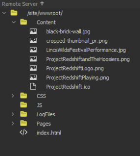
To make my files easily accessible I logically stored them in various folders in trees that enable them to be sorted and easily found. I gave them logical file names such as the About page’s html file being called ‘About.html’. Images also received logical names and were all stored in one ‘Content’ folder to keep them together and easily update-able.
My HTML was relatively good on the first pass through the W3 HTML Validator, with the only noteworthy error on my part being the use of the ID identifier for the Project Redshift spans when I should have used the Class identifier as there is multiple instances of it. However after fixing my markup there was still one error that occured:
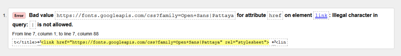
When generating my references for the Google Fonts I wished to use the link generated by the google fonts website was invalid HTML code. The character that makes the url invalid is “|” U+007C VERTICAL LINE, used in this case by Google as a separator between font names; which is a reserved character, both by the “URL Living Standard” and by the Internet-standard STD 66 (RFC 3986).
To fix this I use percent encoding (% encoding, as defined in the URL specifications) for it, writing %7c. This made all my HTML valid.